|
|
|
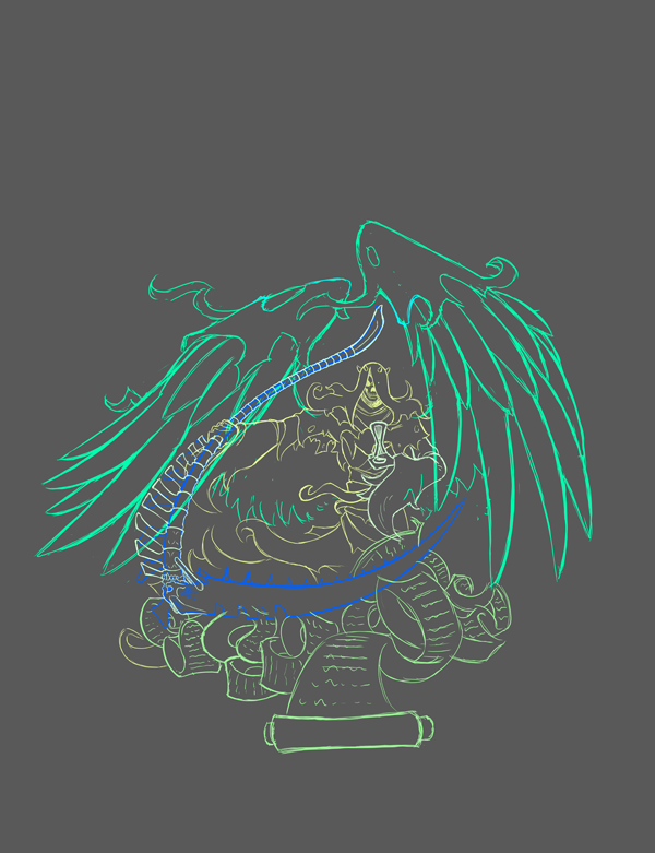
Hrmm, still not quite sure about this just yet.
Wings feel a bit too small at the moment. The scythes position still feels too static. I'm wondering if I shouldn't just bite the bullet and put work in some forced perspective. Issue I'm running into is finding an interesting position for his arms to fit its current position. I'll continue playing with it to ensure its worth putting onto a shirt. ^ _^
0 Comments
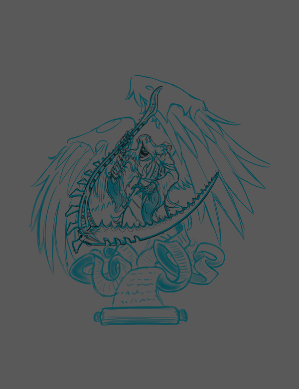
I wanted to do something a bit lighter for my next piece and remembered I had this older sketch laying around.
So was cleaning it up some. Looking at it now though his body language feels a bit too benign so I'm thinking that might just redraw it to get something a bit more threatening. Since its a simpler piece without a major background I think It might end up being ideal for a shirt design. Tell me what you think, I crave feed back, feed it to me! XD Finally it's complete!
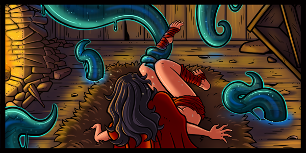
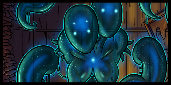
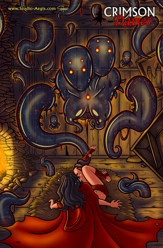
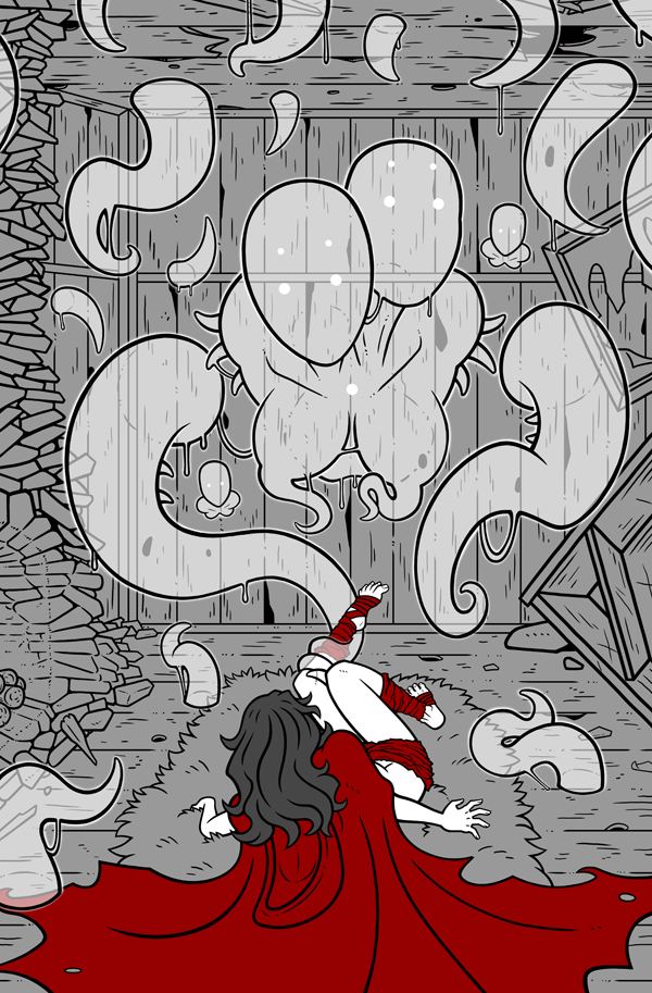
I had to walk back the colors for the phantom, but also adjusted the colors and shading. It works much better now. As this is a Novella piece I sadly cannot allow the final version to be loosed into the public just yet. Copper Tier Patrons and up though will have early access to the Completed version! With / Without Logo, High Res, and the .PST are available for the various Tiers. For as little as 2 dollars a month or an equivelant one time donation You can recieve access to this and much more! A little goes a long way towards helping me to work towards improving my living condition and speeding up production! ^ o^ Don't forget to tell me what you think of the finished product! ^ o^ https://www.studio-aegis.com/patronage.html Brother mentioned that the phantom looks too much as though shes made out of an oily bubble, and that he preferred the blue.
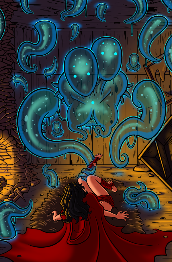
I had changed it from the blue initially because it felt as though it were clashing too hard with the orange and reds of the rest of the scene. I'll tone down some of the sheen and see if I can find a better color for the phantom. Thinking about it now maybe it would work better if the smaller tendrils coming through the walls were desaturated, and let your eyes more thoroughly focus on her main body. Or perhaps I should take it a step further and remove a couple of said tendrils to make it feel less busy. Hrmm yeah I think that will help out alot as well. Working in the colors and textures for the phantom.
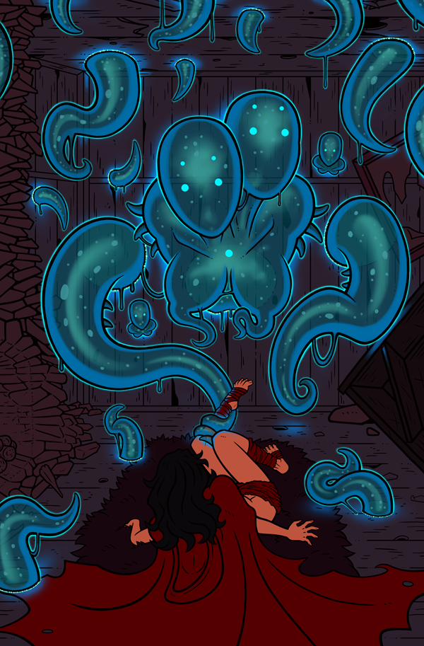
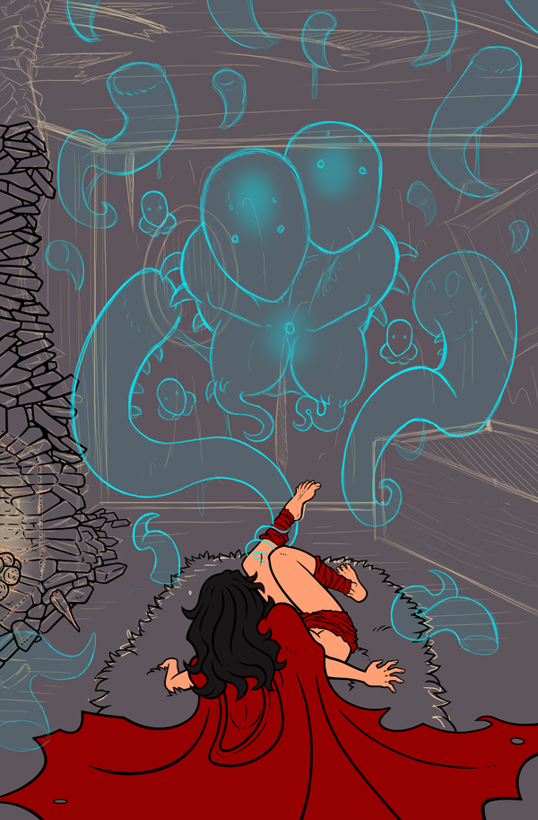
Its sort of like a liquid or slime capable of passing through walls. I'm trying to get a sense of it casting a light glow. Not sure how well the effect comes across just yet. Lots of refining to do still. I'll start working in the light source from the fire place in next. Phewa man I need to get my sleep schedule under control. I don't even know what day it is right now. Feels like this is taking longer than I expected but at the same time I think its moving along at a fairly decent pace.
I don't think there will ever be a point where I'm satisfied with how long these illustrations take. Got all the backgrounds in, got the perspective mostly working out, I should be able to start putting colors in tomorrow. :D Tell me what you think so far. I'm always hoping for feedback for my stuff... and comparitively rarely receive any. > _> Don't forget to follow me on the various places I post to to keep up to date with my goings on. ^ _^ Facebook, twitter, DA, Patreon, etc. Links below in the footer, just click on the icons. ^ _^ Why did I design such a crazy chimney? XD
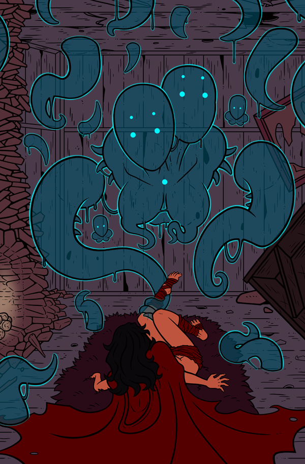
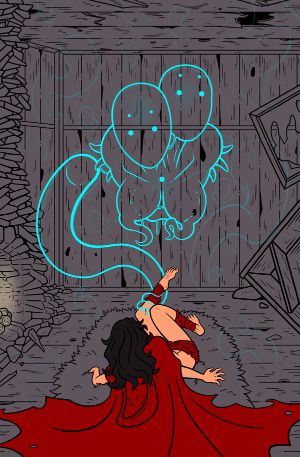
I need to put in all of the background for this piece since the Monstress' phantasmal form will be translucent. Its starting to come along though. Not sure about that left hand just yet though. How does it feel to you so far?? |
|
© 2000-2024 Jose Rafael Cruzpagan III Studio-Aegis, All Rights Reserved

 RSS Feed

