|
|
|
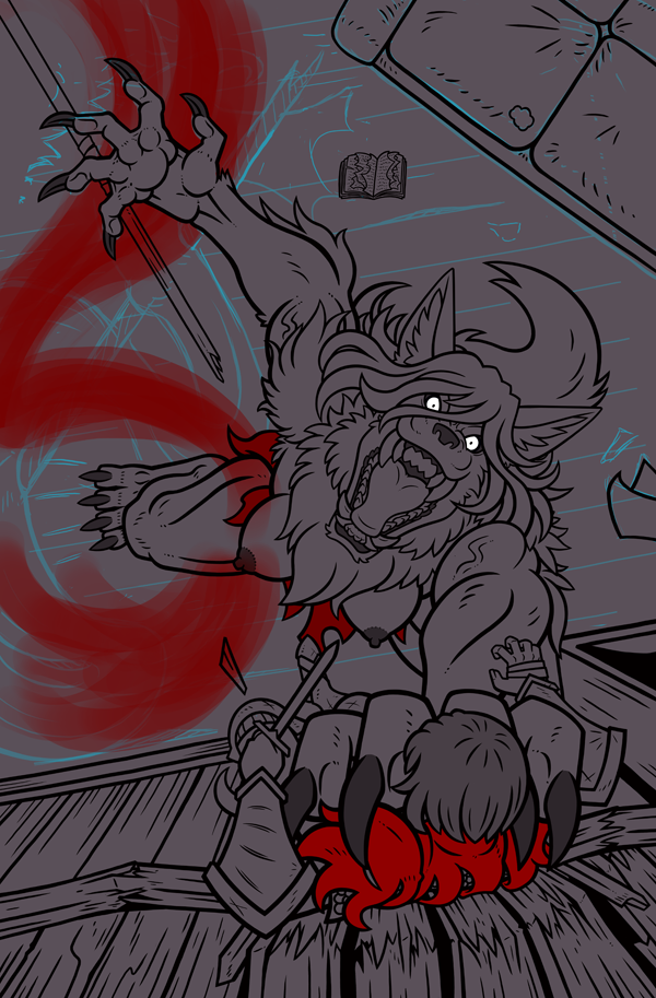
Phewa I'm betting that people are getting pretty sick of seeing this pic at this point. Y oY
Decided that I needed to adjust Standard's banner on along the ground. Given its striking color I needed to make sure that its set up in such a way that it helps to strengthen the flow of the overall project. Also I again changed up Standards hair as I was reviewing some of the past iterations and came to the shocking realization that one of the earliest variants really did look best. :\ On one hand it feels like I've wasted time, but on another its it will ultimately benetit the overwall quality of the work. Two questions I've been asking myself repeatedly at this point is... 1) Does it angle of the piece make sense yet? I've heard from at least 1 person that it feels like she was jumping, and 2) that her breast stick out as weird. Maybe that's just personal taste though or its actually an issue and just no one else has brought it up yet. So I wanted to ask you all, how do those elements feel to you thus far? Is there anything else thats not quite as strong as u think it could be? Even if you can't draw voicing what feels off could still help me a lot with zeroing in on the source of the problem. Thanks again, everyone for your continue support! You really don't know how huge a deal it is for me. I'll be researching the next round of adjustments for the website soon. I'm considering moving everything over to word press. It will be quite the ordeal but there's a much larger number of options that will be opened up such as tighter control over membership content. Likely though I would lose several degrees of ease of use that I'll have to figure out.
0 Comments
Leave a Reply. |
|
© 2000-2024 Jose Rafael Cruzpagan III Studio-Aegis, All Rights Reserved

 RSS Feed

